Sunday, December 8, 2013

Mannerism


     Freedberg’s chapter on painting in central Italy (1535-1575) begins by describing an emergence of Mannerism, as an evolution not marked by any sure distinction, but more as an emotional experimentation, as much as certain dissent from the High-Renaissance canon, by individual artists, “initiated” by early generation and continued by the next. High-maniera is both an exploration of potential in the work of early mannerists, and also a highly restrictive “genre” concerned with combining a deliberately stylized reality with artifice and ornamentation, with no room for nonintention. These artists looked to both Michelangelo’s sculpture and (Raphael’s as well) sculptural paintings, and to classical sculpture as part of a new canon of painting. A purpose emerges in using/referencing older works out of context with multiple, complex and perhaps contradictory meanings. An extreme relationship with contemporary literature also emerges, reflecting heavy use of metaphor and allusion, with the visual result not always fully interpretable by the viewer. Described is the (contradictory?) quality of duality and dislocations of the meanings in high-Manierist religious art, thus creating a sense of (religious) excitement. Perhaps the best definition of the best of the high-maniera work is one of many multiple (if unrelated) meanings, skillfully applied, with extreme care with regard to aesthetics in which it was the viewers task to synthesize meaning, bringing their own intelligence and education to bear upon the work, and to parse a meaning of their own devising. Freedberg points out that maniera painting is generally regarded as a “decline” from High Renaissance, and Craig Hugh Smyth quotes others with the same regard in his treatise.
     Smyth lists nineteenth century (negative) perceptions and attributes of mannerist painting, namely the use of Michelangelesque forms and style. As well, the change in status of the painter from journeyman to courtier is further blamed for the decline in quality of Mannerist works. Problematic is the interpretation of the seemingly many forms of Mannerism, and how these interpretations, the forms, and terms used to describe them changed over the centuries since the Cinquecento. Derogatory comments seem to consistently dwell upon reliance on imagination and style, rather than nature itself. (rather opposite of our contemporary work) Conversely, changing tastes of the Seventeenth century see mannerist work as “fantastic”, and all characteristics are seen in an aesthetically Positive light. Further characteristics of Mannerism are explored, such as a uniformity of  figures, and a seeming canon of awkward physical poses for figures, and a flattened light source often used, the importance of the portrayal of minutiae, and of odd portrayals of space (“broken” and “divided” and “not easily grasped”).

      Mannerism obviously encompasses so many different characteristics it may be impossible to define or encapsulate all work that may fall within this loose term for the work of many artists over decades, and whether it was deliberately anti-classical, or simply experimentation, or whatever, it is certainly interesting, and often beautiful, for all its strangeness.

     All aspects and contexts considered, The Laurentian Library is an architectural (and artistic) work of genius, and I believe the Ricetto in particular (in its relation to and function as regards the transition to the reading room) to be a work of sculpture rivaling any of Michelangelo’s more “traditional” marble forms, or any other sculptural work, past and present. As I read more about Michelangelo’s work, and its interpretations through the ages I found myself both consistently drawn back to the Ricetto, and continuously awed and ever more fascinated by the room, and Michelangelo’s genius in executing it.
     It would be awesome if built from new foundations, yet Michelangelo designs and installs it above an existing two-story structure, over two separate levels, with minimal alteration to the same. Michelangelo embraces challenge, and his finished product is beyond success, and (as is typical of Michelangelo’s work) perhaps beyond complete understanding.

     This structure was a huge influence in Mannerist architecture. Michelangelo’s position as the archetypal Renaissance man is complemented by his pioneering maniera, an impassioned and highly personal and innovative style that changed art in his own lifetime, and forever. His complete reworking of classical architectural elements on the walls of the Ricetto, and the contradictory/complementery effect of his staircase (an incredible work of sculpture in itself), both on each other and on the mood of the reading room is somewhat overwhelming to contemplate. The effect on the very psychology of the viewer, and the viewer’s double role as observer and participant, and the powerful experience invoked is something rarely (if ever) achieved by artists today. That Michelangelo was a deeply religious man, and yet this structure, set in an ecclesiastical complex, is composed almost exclusively of secular forms, is another fascinating aspect. Not to mention (well ok, I am mentioning it) that he worked on this while also working on the Medici Tomb and the Last Judgement of the Sistine (among other projects). The cumulative effect of reading about Michelangelo this semester has been somewhat staggering to myself. It has been (an “awesome”) personal pleasure to learn about the unparalleled accomplishments, works, and genius of Michelangelo Bounarroti.

“… the message is that we do not control our fates.” Is a powerful line from Hall’s After Raphael, describing Michelangelo’s The Last Judgement from the Sistine Chapel. Interesting how Christ is portrayed in an Apollonian fashion and the figures seem to revolve around him. Really interesting how Michelangelo borrows and portrays Dantesque imagery here, artistic choice and license typical of Michelangelo. Nice touch in the self portrait in Bartholemew’s cast off worldly skin, allusion to Michelangelo’s own failing body in no small way due to the painting of the ceiling some 20 years earlier. The fact that Michelangelo makes own decisions in portraying the last day, hell, the damned, demons and angels is testament to his immense genius and creativity. His Mannerist influence is commented on by Hall, as the poses of the figures of the Last Judgement are copied and used (often without the same thought to context that Michelangelo employs) by lesser artists in their later projects. Michelangelo’s choice to portray the resurrected spiritual bodies as nude is examined by Hall from the perspective of the frescoes’ contemporary audience.
     Hah, Aretino criticizing Michelangelo’s nudes actually got me laughing. (Thankfully,  hah again, we have outgrown that kind of self-serving character assassination of the artistically talented. “Most writers were not adept at putting into words what they objected to…” and so Michelangelo’s nudes become an easy target. (The inarticulate attacking the insightful… again familiar.) Apparently most of the criticism concerns the untalented determining what is artistically appropriate for religious works of art. What need of the artist then? These theologians and academics should really have been given free reign to scratch and mark whatever surface called for this imagery, that would have been some great stuff. Oh yeah, “appealing to the popolo”, a sure recipe for something special. Rather than immediately understandable, art must be contemplated, and great art endlessly contemplated. (It is the stop sign, and the bathroom signifier that are immediately understandable.) What strikes me most about the second Hall reading are the parallels to the understanding and regard (by those willfully ignorant) of contemporary art today.
     Steinberg’s Art in America article expands on more recent critics interpretations of The Last Judgement before giving his own interpretations in 15 points. He proposes that the body position, face, and gesture of Christ are deliberately ambiguous, and cites earlier attempts by Michelangelo to be deliberately so. (Julius II sculpture) Steinberg proceeds to offer very plausible interpretations of Michelangelo’s work. One of the best is the Dantesque imagery placing Hell in poetic parentheses, in effect relegating the concept of a physical Hell to fable. Other propositions illuminate an enlightened, merciful, hopeful, if heretical Michelangelo, a man with a personal Christian belief, not blindly accepting of church dogma, with the courage to portray it. (if hidden within a dense and richly complex polyvalent work) Steinberg also illuminates the tendency of an interpretation to endure, irrespective of the source material, specifically the negative and punishing interpretations of The Judgement, that may have originated, in part, to distract from an interpretation of the resurrection by Michelangelo that had diverged from the Church’s.

     In all, I very much enjoyed reading Steinberg’s article. It was full of information, and skillfully expounded on an interpretation of Michelangelo’s work (and the man himself), that (true or not) was refreshing, educational, and entertaining.

Michelangelo (reposted accidentally deleted post)

I have never felt salvation in nature, I love cities above all.” This quote attributed to Michelangelo di Lodovico Buonarroti Simoni is a favorite of mine, and illustrates a love of architecture (as well as a distinction between himself and his contemporary and “rival”, Leonardo) in this archetypal Renaissance man. While Michelangelo considered himself a sculptor above all else, he was also responsible for two of the most influential frescoes in Western art (Sistine ceiling, and The Last Judgement) as well as numerous extremely important architectural achievements.
     My research into Michelangelo’s architecture focused on one such project, the Laurentian Library of Florence. The Laurentian Library was named after “Il Magnifico” Lorenzo de’ Medici, a great collector of ancient and modern texts, who had greatly expanded the Medici library in the late 15th century. Another Medici, Cardinal Giulio de’ Medici, upon attaining the Pontificate as Pope Clement VII, commissioned Michelangelo to build a new Medici library in 1524. The purpose of this commission was to bring the Medici book collection back to Florence, and to further establish the shift “of Medici power from mercantile to ecclesiastical activity.” (Ackerman 34)
     Michelangelo, as an extremely prodigious artist, is one of the best documented artists of the 16th century, and the Laurentian Library is one of his best documented projects. The commission from Rome, and the resulting correspondence between Michelangelo and the Pope’s agents in Rome (many dozens of letters and drawings exist) between 1524-27 (and for more than 30 years after) has given scholars much insight into this ambitious architectural accomplishment.

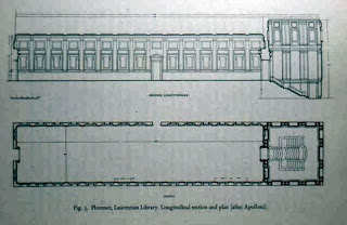
     The library was to be located in the cloister of the Church of San Lorenzo. After some debate as to the specific site (a courtyard site was rejected as it would block the view of the façade of the church) it was determined the library would be constructed above the existing two stories of the monastic quarters. (A further challenge to Michelangelo’s architectural skills, but one he was more than able to overcome.) A major theme of the early correspondence was the Pontificate’s concern that disturbance to the lower floors be kept to a minimum (if at all) and Michelangelo’s of sculptural form and space manipulation. Michelangelo was able to uphold the integrity of his disegno through a structural reinforcement of the lower stories’ walls by designing and installing a minimal inner and outer system of buttresses that would conform to the aesthetics of his overall plans for the completed structure.
     Michelangelo’s Laurentian Library consists of two separate and distinct rooms. The reading room is just that, with a traditional layout, regular window spacing, and beautifully designed walnut furniture. The room is intensely horizontal, 152 feet long, 35 feet wide, with a ceiling at 28 feet. The windows provide light by which to read at each desk. The wooden reading desks sit along both walls, (with the reading tops part of the seats in front) a long walkway between them runs the length of the entire room. The overall feeling of the reading room is one of quiet tranquility. The Vestibule (“Ricetto”) is quite intentionally different from the reading room in all respects. Intensely vertical, (even more so than originally intended by Michelangelo, as his intended skylights were rejected by the pontificate as likely to leak rainwater, and so were replaced by windows above the rooms tabernacles, therefore raising an already high ceiling) the square room’s floor is many feet below the floor level of the reading room, and the classical architectural aesthetics of the room correspond and accentuate this verticality.
     Where as the reading room’s still but ornate decorative elements promote quiet study, the vestibule’s aesthetics have a completely contrary effect. This is a room that has been turned outside in with respect to the interior wall treatments, which since Greek classical antiquity have belonged outdoors. John Sherman (from his book “Mannerism” 1967) describes Michelangelo’s innovation of the Ricetto interior, “The principal development here is an application of license to all architectural members.” As regards the wall treatments, nothing is as it appears. The “tabernacles”, an architectural feature denoting a niche to hold sculpture, are empty, resembling more a window, though they are part of the wall, they serve neither purpose, and make no immediate sense. The (over-sized) scroll-shaped volutes beneath the tabernacles are detached from them, and so their usual supporting use is irrelevant. Further, where these volutes meet in the corners of the room, their forms merge, and so even their physical solidity is drawn into question. The double columns spaced throughout the room are recessed into the wall, in opposition to a separate, outdoor and support role normally played by such an element. The walls (containing the tabernacles between) seem to emerge and push inward into the room. The effect of the recessed columns, and “emerging” walls has been described as organically mirroring the male human form (appropriate to Michelangelo’s aesthetic ideals) creating the effect of a skin “pulled taut” over musculature beneath. The apparent thickness of the walls suggest that they are structural, where in fact they contain loose fill material and the double columns support the roof beams. Pilasters (square columns) are another feature of the walls but they are placed sideways to the other elements, and in their use in the tabernacle design, increase in width with height, both traits are odd and in opposition to traditional use. Michelangelo’s contrary use of these classical elements would be disquieting enough, yet the vestibule’s only necessary feature, a staircase, adds a necessary element that furthers, and expands the tension of the room.
     The design of the staircase of the Ricetto of the library is said to have come to Michelangelo in a dream. An earlier design called for a staircase divided into two wings that met in a landing at the reading room doorway. Michelango earnestly diverged from this plan. The staircase is really freestanding work of sculpture. (as well as the first freestanding staircase in Europe. It has been described as an “alien intruder” and seems “to pour into the room like a flow of lava” and it’s color contributes to this description as well. Composed of three staircases, the central for the master, the sides for his retainers. The convex form of central stairs, and the varying widths of the treads further lend to this expansive effect, which confronts a user of the stairs as they climb upward “against” this phenomenon.


     In the vestibule, the outward expansion of the staircase and the inward tension and compression of the walls invoke a disturbing frustration upon the observer, who in the necessity of using the staircase, also becomes the subject of this sculptural/architectural work. Michelangelo’s seeming unification of design through the use of visual (and psychological) contradiction in the Ricetto is satisfied (and furthered) upon the viewer entering the reading room. The frustration and disquieting confusion of the vestibule (appropriate to a room for conversation and debate of the libraries’ subject matter) only intensifies the experience of relief in the viewer as they enter the atmosphere of tranquility and release of the reading room.